Popular This Month: Orange Interior Design
February 2, 2024
Orange in interior design?! Surely not. Orange is just too much! But nothing is too much for you, and orange can and will take its rightful place in interior design. Sure it’s an obvious choice for an accent colour, but orange can and should be the main event when it comes to ideas for interior design for your home.
Orange in Interior Design will make you happy!
Frank Sinatra said orange is the happiest colour. I’ve no idea how Ole Blue Eyes came to make this statement, but if we can’t believe a crooner when it comes to interior design and our psychological states, then I’d like to know who we can believe.
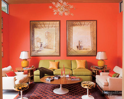
Orange has been described as a versatile colour, meaning you can use it wherever you please. Orange can be part of the interior design for your entertainment areas to ensure an enthusiastic and excited mood for your guests, and yet orange can also be warm and cosy, making orange an excellent choice for a snug or your bedroom.
If the same colour can be suitable for different moods, it’s because it’s the hue that makes all the difference. A lighter shade will encourage a more energetic vibe, while a darker one will bring cosiness, as well as a touch of sophistication.
The only thing you need to ask yourself is how much orange you want in your interior design. Anyone can see a bright bold colour and assign it to the role of accent colour. But what if your love for orange means you want it everywhere – orange walls, orange floor, orange furniture? I say go for it! I also say you might want to bear in mind some classic interior design guidelines.
Orange in interior design is to be complemented
A colour wheel is the perfect guide to finding the colours that will complement orange in your interior design. The complementary colour is the one that offers the most contrast. The colour opposite orange on the colour wheel is blue.
A very handy guide in interior design is the 60-30-10 principle. So 60% of your room will be in orange (oh yes it will!), 30% in blue and 10% will be the accent colour – perhaps a neutral, or maybe even a colour that is analogous to orange or blue. With the right hues, there’s no such thing as too much colour. By ensuring the shades are harmonious, you’ll be striking the right mood with orange leading the way in your interior design.
Different patterns and textures will also help break things up and add depth to the room. A Roman blind in Ember or Kerela Spice fabric will be divine alongside your terracotta walls and tangerine duvet set, all complemented by the soft teal carpeting on your bedroom floor. That’s how orange interior design can bring warmth and splendour to your bedroom.
Analogous colours will embolden orange-based interior design
Analogous colours are the ones that sit next to the chosen colour on the colour wheel. It’s yellow and red that cuddles up next to orange. This might sound all very bright, too bright, for you. Again, it’s all about the shades of orange, red and yellow you employ to keep the palette mellifluous and on point. Your copper-coloured Vertical blinds will combine with your golden yellow couch, and the rose gold walls. Vibrant in summer, cosy in winter, what more can you ask for from your living room?
Accents in orange will lift your interior design
Perhaps this blog has been too orange for you. If orange were to be part of your interior design, maybe you’d rather orange play its part as the accent colour in your home.
Just 10% amber for curtains and cushions, to enhance the 60% warm grey and 30% dark blue of your decor, and you’ll have an inviting yet urbane interior design.
Whether you feel you only need a little or want a lot, there’s always a place for orange in your interior design. It’s cold out, so embrace the happiness of energising yet warming orange.