Popular This Month: Dark Red Interior Design
December 1, 2023
I’m going to be honest with you. We’ve got one of these colour trends for each month. Are you a slave to trends? Will you be redecorating your whole house to match each colour we babble on about every four weeks? Of course not. This is exactly why I don’t follow trends. They’re clearly nonsense. I recommend you wait until your favourite colour comes up and then let me justify why you’ve gone and painted your living room International Orange (to match the Golden Gate Bridge of course) with accents of fandango (that’s a reddish-purple, like a pomegranate). That way you can decorate any way you please.
But this month belongs to dark red. So let’s get some cherry, scarlet and sangria into December!
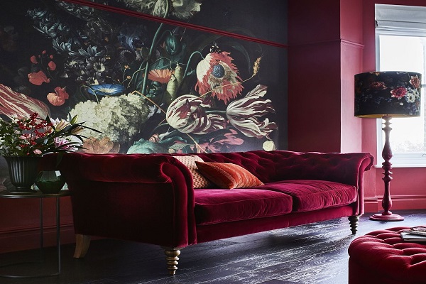
Bring some dark red into your interior design to chase away the winter blues
It’s time to start hibernating. Only us humans can’t get away with that. You need to stay awake during traditional working hours so you can pay for the greetings this season brings.
You need to stay conscious, be alert and get everything ready by 24th December. You need dark red in your interior design.
Red is taking an interest, a passion bursting forth, getting things done. Red is the colour of fire – destroying the old so the new can grow. Fire cleanses, but there’s no need for you to turn pyro. I know, fire is pretty, but you don’t need to watch the world burn. You can just introduce some dark red into your decor instead. And red warms, just what we all need in the dead of winter. You can take action and be as snug as a bug all at the same time. Being cosy and bursting forth are not mutually exclusive. Can dark red interior design be colour therapy? Yes, of course it can.
What does bringing dark red into my interior design got to do with blinds?
You’re probably familiar with the idea that if you sit in a red room all day, you’ll find yourself getting increasingly angry. This is why this blog is about dark reds, not bright reds. If you want an intense time in your living room, then please, go for bright reds. If you are looking for something a lot more relaxing, read on.
You’ll be wanting a rusty red for the cosiness. Meanwhile, a burgundy will give you both refinement and opulence. A pink red will bring you joy and a midtone red can make you feel free. What a versatile colour red is!
You can look to cellular blinds in Tuscan Red to keep you warm both physically and mentally. Cellular blinds both insulate in winter and help reflect heat away in summer – what more can you ask for in a blind? Luxury, that’s what. Enter the Roman in Blackout Berry and you’ll be forever spotting your neighbours on your front lawn staring at your blinds with envy brewing in their hearts.
The best way to bring dark red into your interior design
On the subject of envy, green (perhaps sage or forest green) will calm down all that deep red, as will a mustardy yellow. Perhaps you don’t want to calm it down, so team up your deep red with a cerulean blue for the most lush environment. It may be winter outside but you can keep it warm inside. And of course you can add further texture with pattern and the fabric you choose.
Perhaps you need to feel stimulated in your home office. A shiny metallic red Venetian might just be the answer. And if you’re looking for a more modern look, don’t forget the glamour and sophistication vertical blinds can bring. A patterned fabric can double up as quite the feature.
How much deep red in my interior design is too much deep red?
Just because it’s red, you may be tempted to keep it as an accent colour. But maybe you do want deep red as the primary colour in your decor. As long as you don’t let one shade dominate, you can have a substantial amount of deep red in your home. Deep reds were once a traditional choice for decor, and like all trends, it’s going to come and go. So if you love red, go for it, and let the deep red make those beige scatter cushions look even more inviting in their contrast.